
10 things you did not know about typography
The typographic universe is immense and fascinating, and it is not only for those of us who are part of it. In fact, whenever we tell someone what we do and the complexities that lie behind something as ubiquitous as fonts, we realize the interest it sparks and how it captivates the listener. One of our missions is to contribute to the dissemination of typographic culture. So here are 10 interesting things you didn’t know about typography:
1.FONTS ARE DESIGNED BY SOMEONE

2. MATHEMATICAL CURVES AND OPTICAL CORRECTIONS

3. kerning – COSTOMIZED SPACING

4. hinting – ON SCREEN VISUALIZATION

5. TYPOGRAPHY IS SOFTWARE
As typography consultants, we understand the confusion surrounding typographic acquisition. Typefaces are considered as software and, legally, fall under this category. When we purchase a font, we’re essentially obtaining a license to utilize it based on the terms we’ve agreed upon or those stipulated by the manufacturer. For example, the cost of a license may vary depending on factors like the number of computers where we intend to install the fonts or the level of web traffic our site receives.
6. WIDOWS, ORPHANS, AND RIVERS

7. LETTERS, CALLIGRAPHY, TYPOGRAPHY, AND LETTERING
The definition of typography is inherently confusing, making it challenging to grasp the concept without conflating it with other related terms like calligraphy or lettering.
Calligraphy is the art of writing with beautiful lettering, distinct from the everyday handwriting we use. Lettering refers to the design of a specific word or block of text, creating a custom composition of letters with a unique design. In this sense, typography is the opposite: it’s a system for reproducing letters. It’s a set of symbols (uniform in their repetition and designed within a predefined system) that make language visible.
It’s possible to simulate or reproduce calligraphy using typography, but for this, each letter must be mathematically defined in advance. In contrast, in calligraphy, each letter is spontaneous and unique, a product of the moment in which it’s written.
8. woff AND OpenType FORMATS
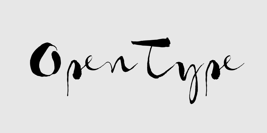
For a period, typographic font formats experienced a sort of impasse. As the early days of the digital revolution faded into memory, the typographic world found itself looking for a solution that could truly meet its evolving needs. Then came the WOFF format, heralding an end to this stagnation, particularly for the web. Following closely behind was OpenType, a format that would eventually establish itself as the foremost standard, capable of accommodating the diverse array of global languages (including emojis). It also brought a thrilling innovation to the graphic design world: OpenType features. These features allow us to incorporate alternative characters, elegant swashes, diverse number designs, or even a bespoke set of icons unique to the font, among other possibilities. This enriches our designs, infusing them with versatility and dynamism.
9. IT TELLS MUCH MORE THAN WHAT IT WRITES

10. SOMOS MUCHOS LOS frikis de la tipografía

Brick Heck (de la serie The Middle) tiene su propio club y podcast tipográfico, por fin se ha personificado a un tipo de nerd que aún no había encontrado representación en la pequeña pantalla: el typefreak. Y es que ¡el mundo de la tipografía causa fascinación! Como en cualquier campo especializado, existen encuentros, conferencias, masters y festivales de este tema e incluso se organizan safaris tipográficos. Se vende merchandising, productos fetiches de impresión en plomo o tipos móviles y camisetas con juegos de palabras tipográficas. Dicen que los diseños curvos activan zonas cerebrales relacionados con la emoción y gustan más que los rectos. Aprendimos en el TypoMad 2015 de Swiss Typefaces y Production Type que el diseño tipográfico siempre busca trazar la curva perfecta, al igual que en una carrera de motos. ¡Las curvas tipográficas sin duda son increíblemente estimulantes!
Brick Heck (from the series “The Middle”) has his own typography club and podcast, finally embodying a type of nerd that hadn’t yet found representation on the small screen: the typefreak. The world of typography is indeed fascinating! Like in any specialized field, there are gatherings, conferences, masterclasses, and festivals dedicated to this topic. Merchandise is sold, including fetishized products like lead printing presses or movable type, as well as T-shirts with typographic wordplay.


