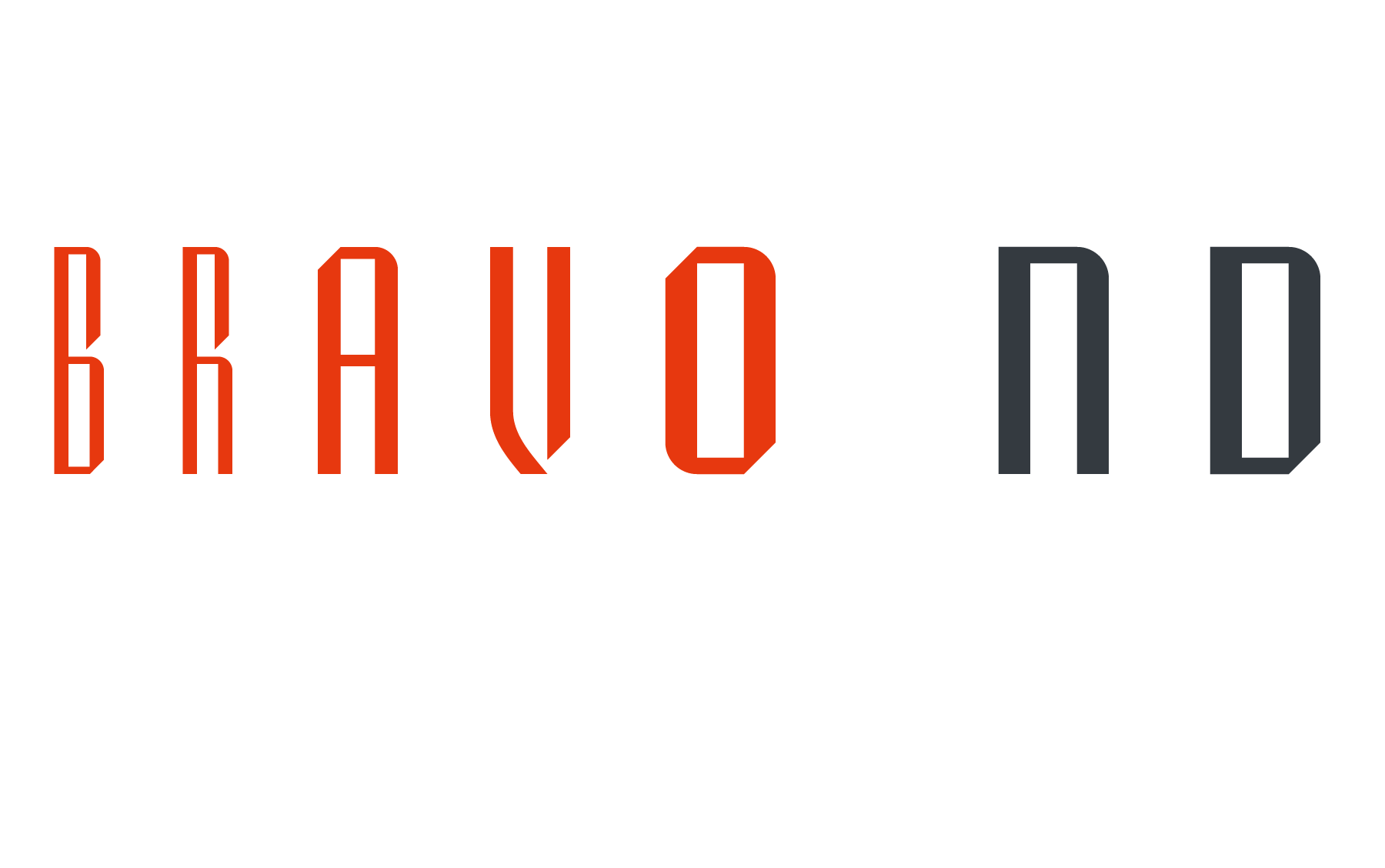
BRAVO ND
Designed by José María Cerezo, with a geometric style and futuristic touches. A typeface family that offers good results in labeling, posters and big formats. Inspired by art deco with a sci-fi touch, it is a typeface with a strong character and personality.
Bravo is a Trademark of BauerTypes SL


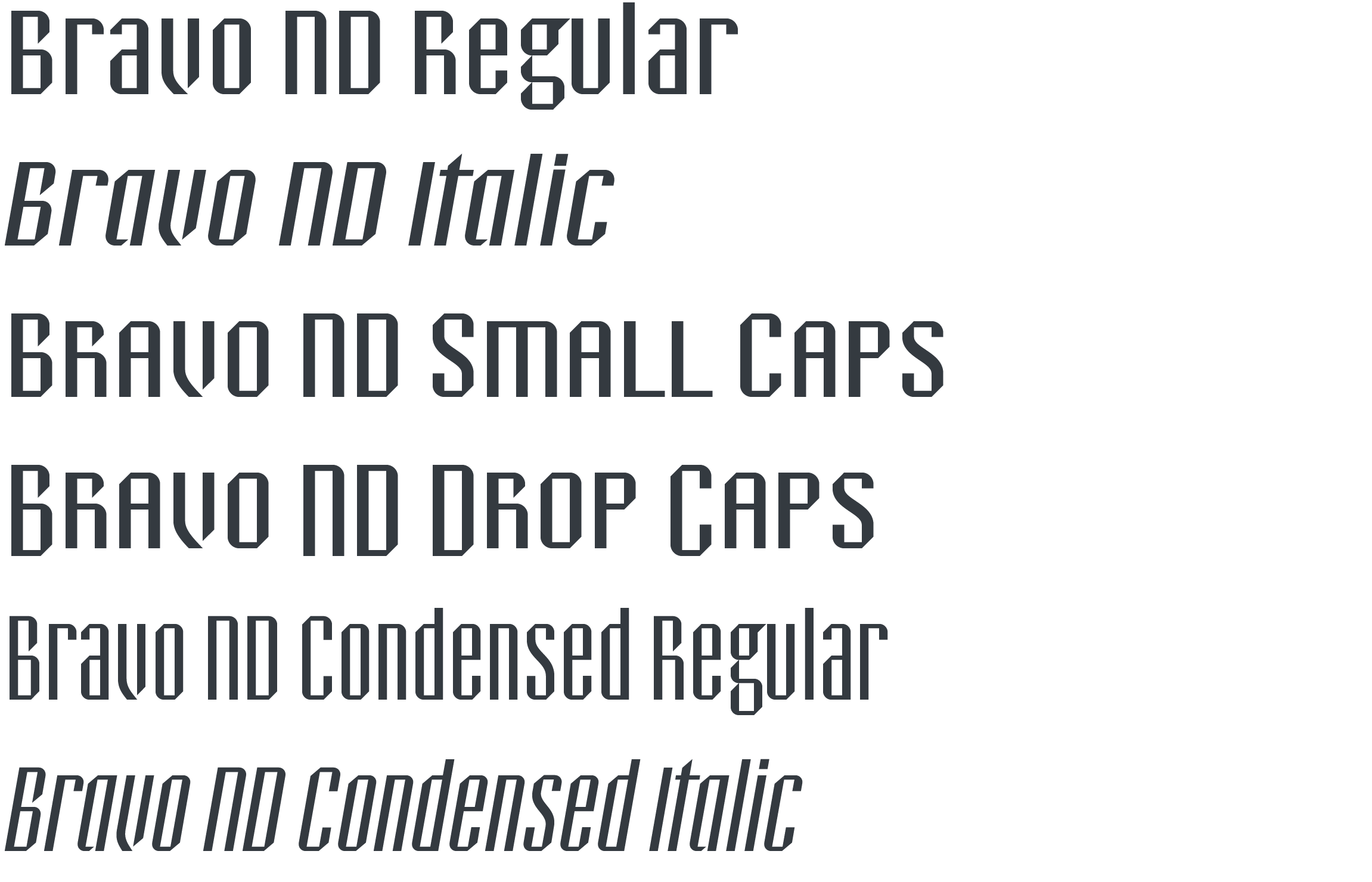
12 INDIVIDUAL STYLES
Available for DESKTOP | WEB | APP | ePub | SERVER | OEM …
Corporate, Broadcasting, Merchandising, Server, Gaming, and more.


ABOUT
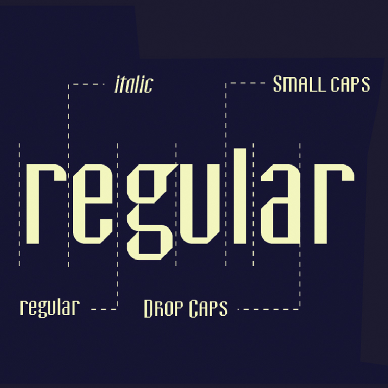
Bravo ND is inspired by art deco. The family, with a large X-height and reduced ascenders and descenders, consists of three series with different levels of thickness, each one with its italic varieties, small caps with figures aligned with the midline (SC) and drop caps with unaligned figures (DC).
José María Cerezo. Besides graphic designer with a long professional career working for both, prestigious and small national brands, José María Cerezo is an author, typography teacher and type designer as well. In 1996 he launched its digital type foundry, Cajabaja. His work has been exhibited, reviewed and highlighted throughout his career in which the editorial field has been one of his specialties. The Medal of Merit in Design of Castilla-La Mancha (2010) crowned his career trajectory.
