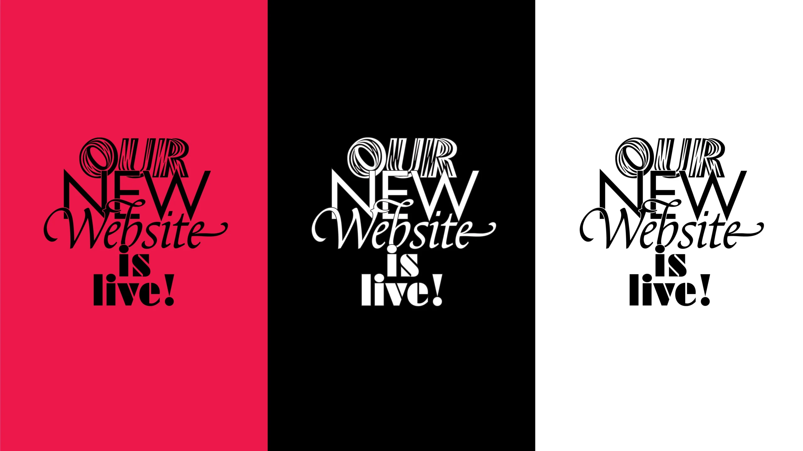
Some processes don’t begin with a clear decision, but with a feeling that something is no longer quite right. For a while, we sensed that our website no longer reflected who we are or how we work. When you work with typography, you work with invisible structures, systems that support the content and produce meaning. If our own digital structure wasn’t aligned with that level of rigor, it needed to be rethought from the ground up.
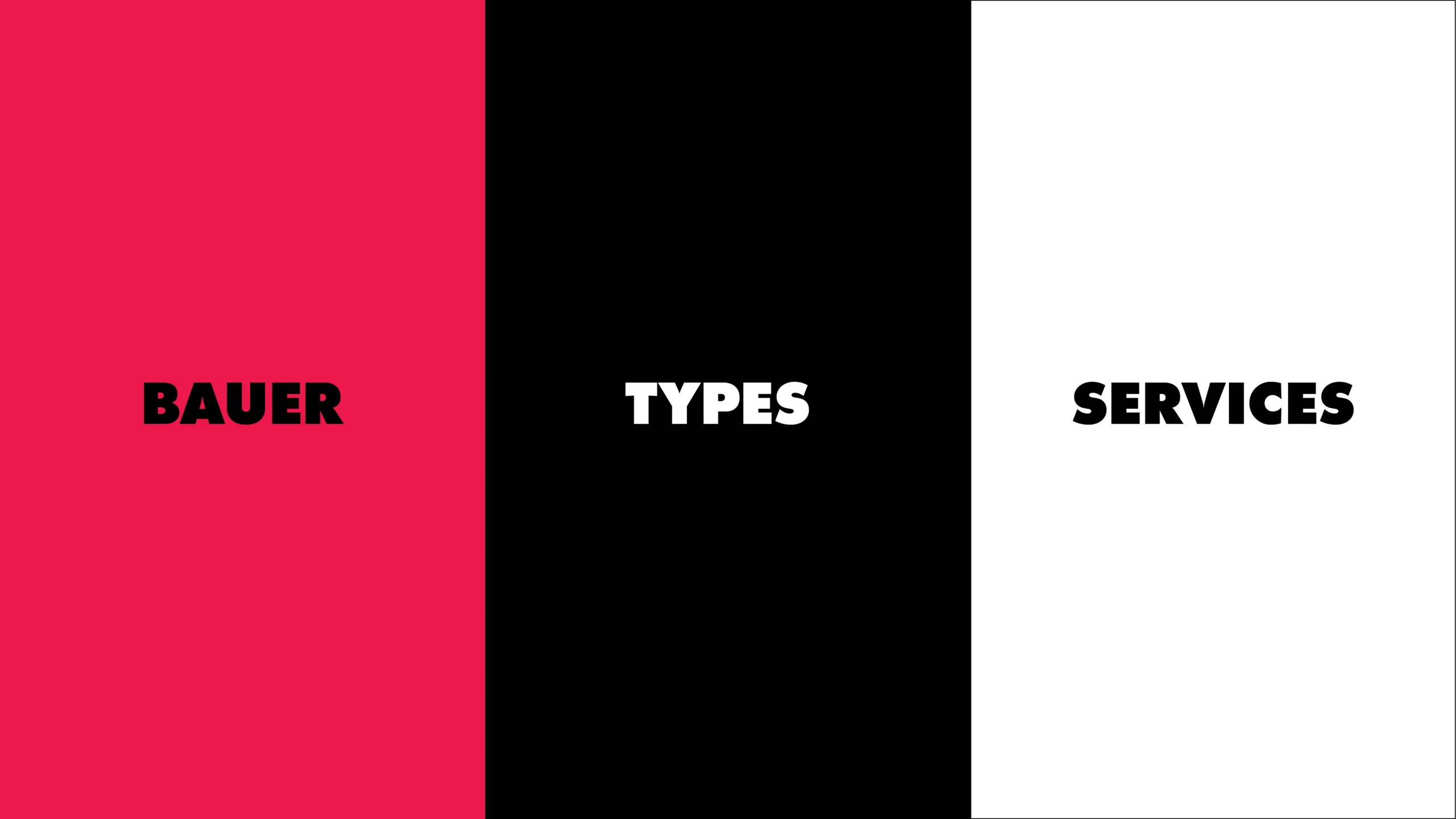
The hardest part wasn’t building something new, but simplifying what already existed. Simplifying doesn’t mean removing information; it means organizing it with precision. In doing so, we realized we also needed to clarify our own brand structure around three pillars: Bauer as the place for history of the company, type news an all related to the company, Types as a living and growing type catalogue, and Services as a client-focused professional practice. These three pillars underpin our updated brand identity, shaping both how we are perceived and how we structure our future direction internally.
The new Bauer Types website is not a simply redesign, but a revision. To revise is to look again carefully, even at what seems to work, and to ask what should remain and what needs to evolve. Our story begins with Bauersche Giesserei, expands to Barcelona with Fundición Tipográfica Neufville, moves through its digital transformation with Neufville Digital, and arrives at what Bauer Types is today. A foundry actively developing typefaces, expanding its catalogue, and working closely with clients to build coherent typographic systems.
Technically, the process was more complex than we anticipated. A typographic website carries its own constraints: complex font families with multiple weights and styles, browser inconsistencies, loading times that directly affect perception. Every decision had consequences for performance and usability. Some parts of the system didn’t work the way we expected and had to be rebuilt from scratch.
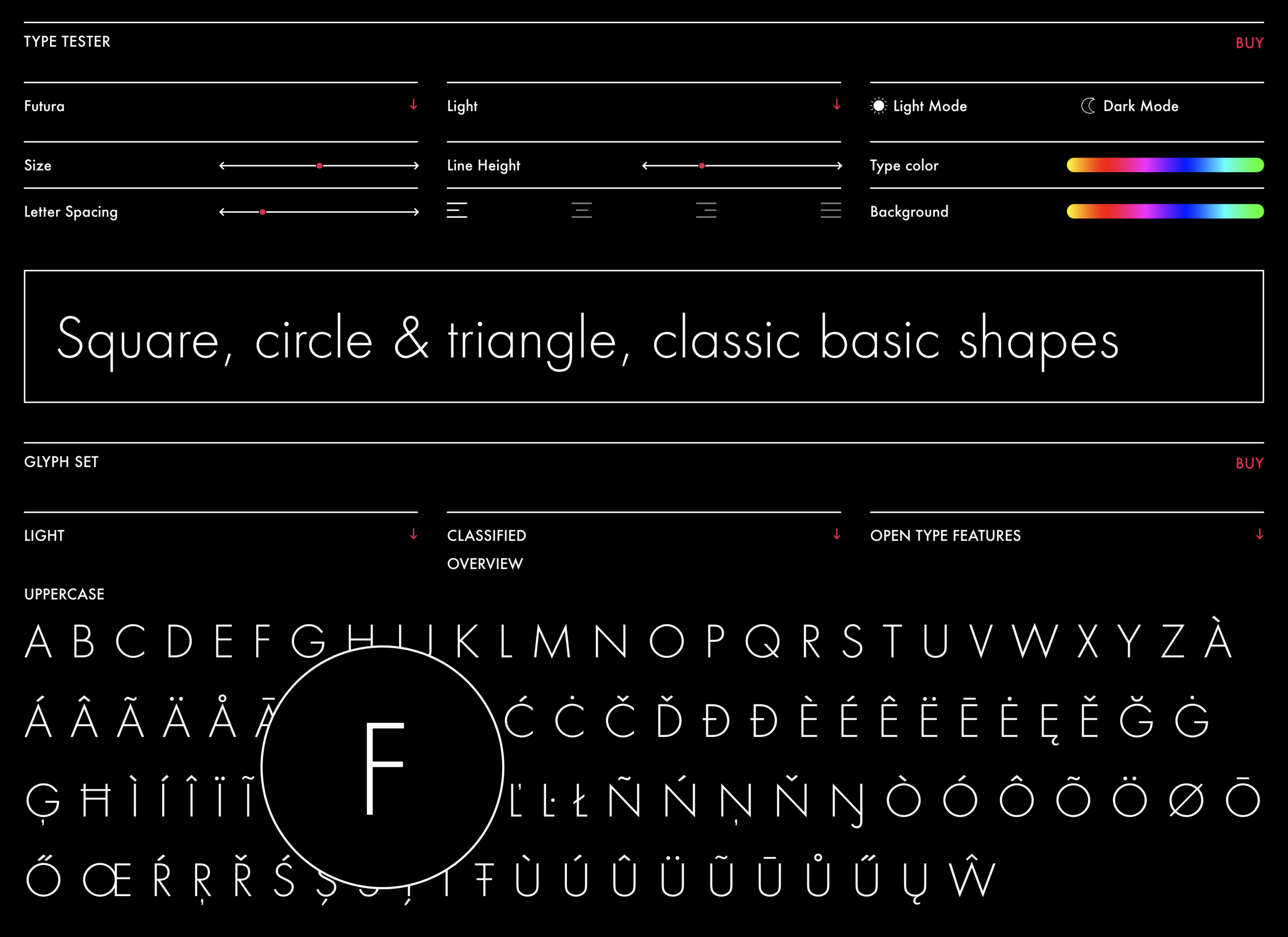
This intention is especially visible in the new tester. We didn’t want a tool made only for specialists, but an intuitive and informative environment that brings typographic complexity closer to anyone interested. Changing weights and styles should feel clear rather than cryptic. Adjusting sizes should reveal rhythm and texture in a tangible way. OpenType features shouldn’t read as technical jargon, but as practical tools that make typography accessible to a wider audience.
This process also pushed us to express something more clearly: we don’t just publish fonts. We develop complete typographic systems, design custom typefaces, and advise on coherent typographic architectures that work across media. We see typography as infrastructure, that means approaching it with rigor, care, and a clear understanding of today’s digital environment.
The new website is not an endpoint, but a position. The structure is now stronger, clearer, though we are fully aware that everything can always be improved, refined, and pushed further, and we are already in that process. The foundation is set; now we continue expanding our catalogue with new type and new possibilities.
🟥⬛️⬜️