Pragma

BUY

DIGITAL VERSION


Designer
Christopher Burke
Year
1992 — 1995
Digitalisation
Neufville Digital
Publisher
Bauer Types

DESCRIPTION

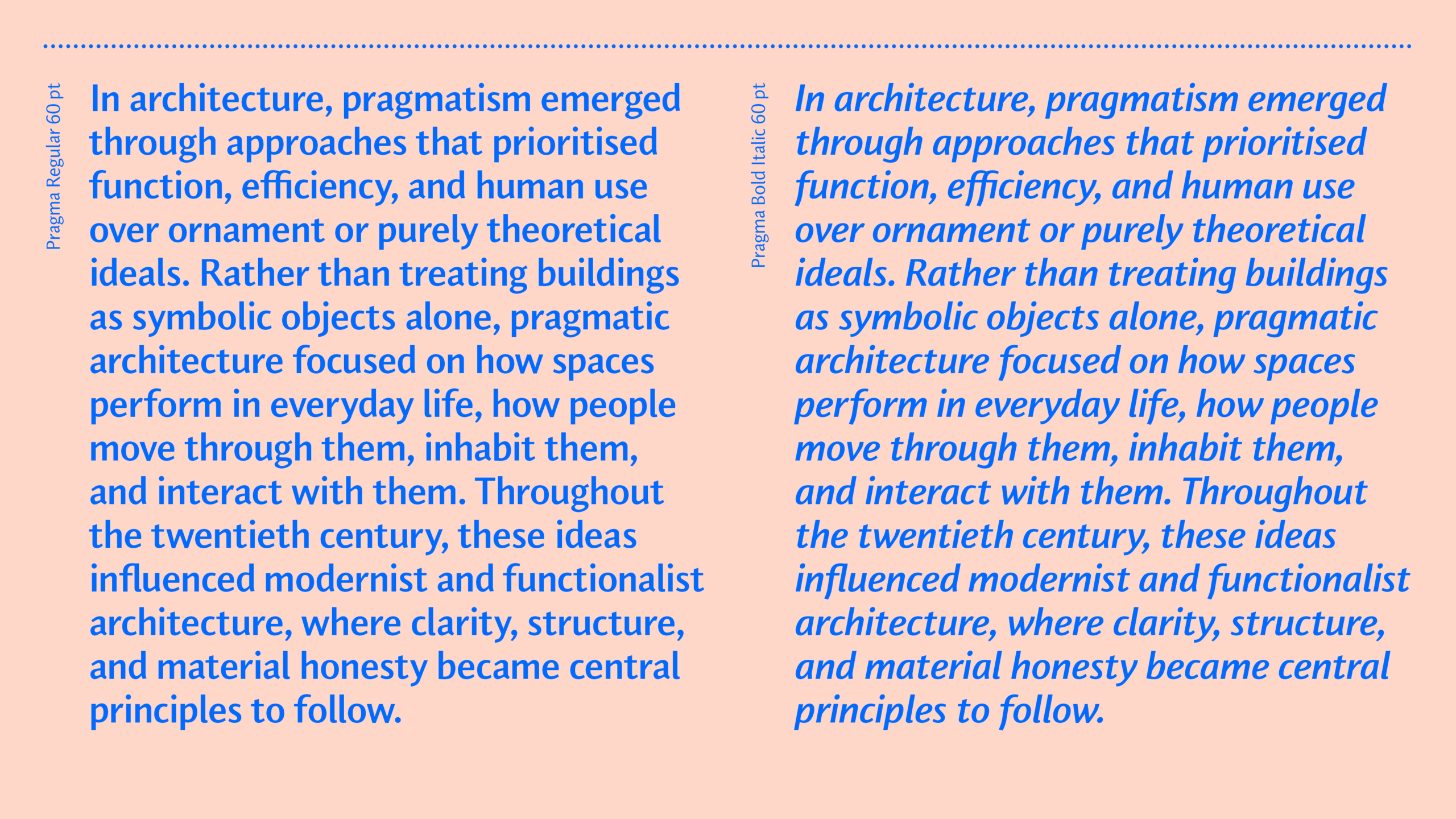
Pragma is a sans serif typeface designed between 1992 and 1995 by Christopher Burke. Combining clarity with subtle calligraphic influence, the design brings warmth and rhythm to the traditionally rational structure of the sans serif genre. Designed with readability at its core, Pragma performs exceptionally well in long texts across both print and digital environments.

Rather than following the smooth modular construction common to many late 20th century sans serifs, Pragma draws from the principles of classical text typography. Its capitals are informed by Roman inscriptional forms, while the lowercase derives from humanistic handwriting traditions. The family also includes a true cursive italic that preserves the movement and spontaneity of writing.

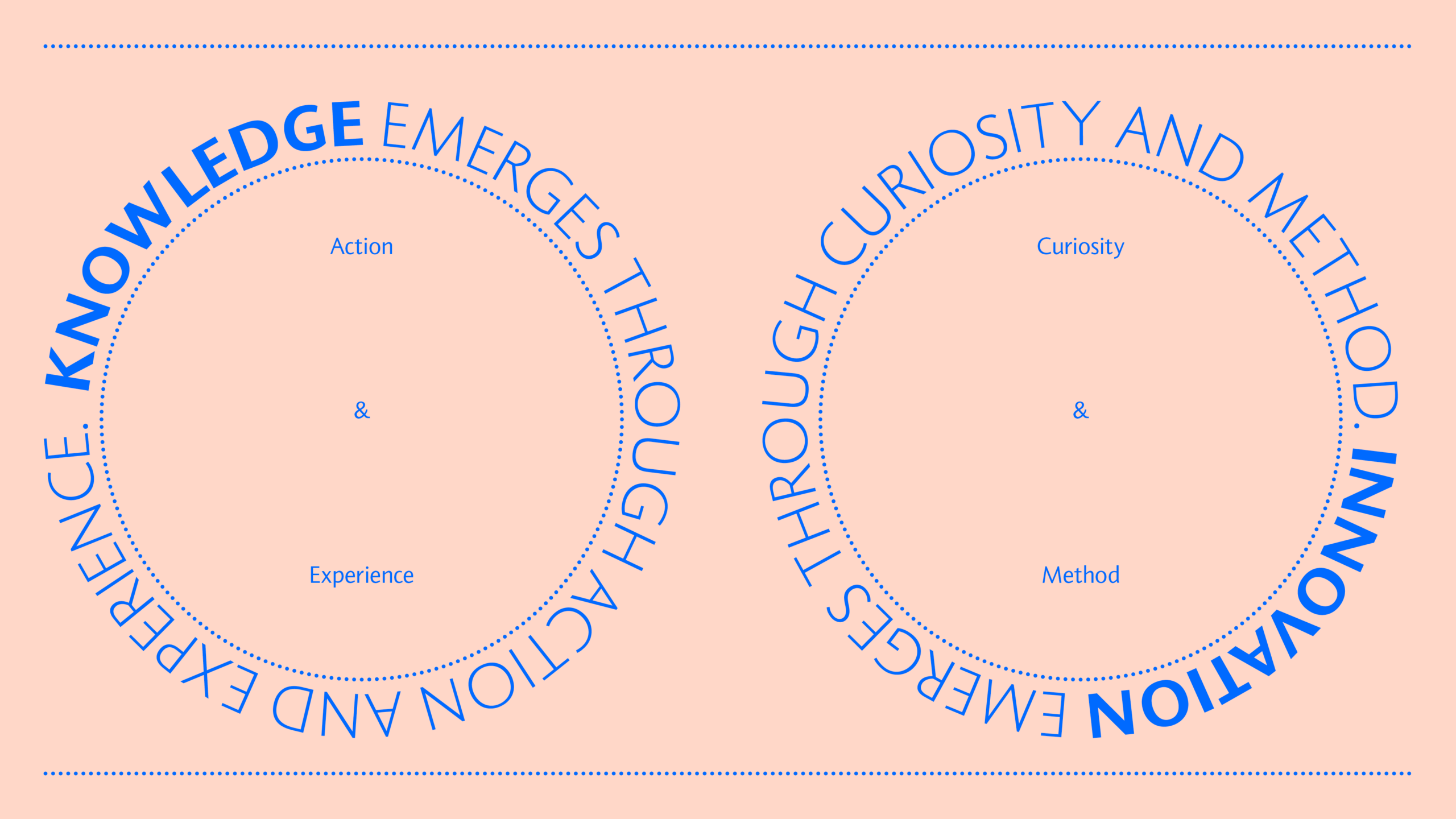
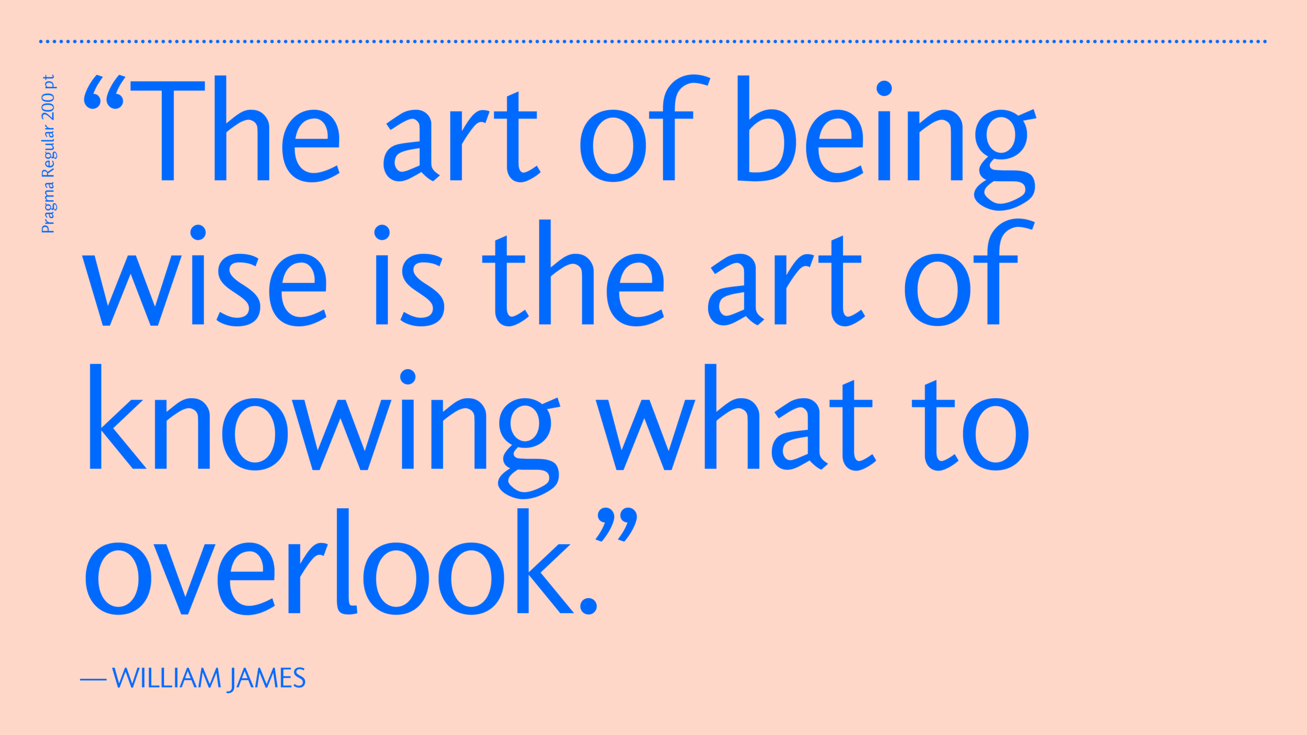
Pragmatism

A way of thinking that focuses
on practical results, usefulness,
and what works effectively
in real situations.

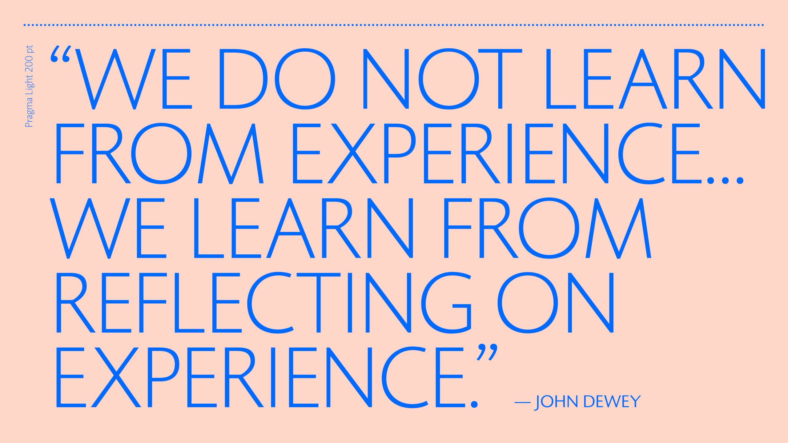
Pragma Regular in use
over photo by Monoframe Studio

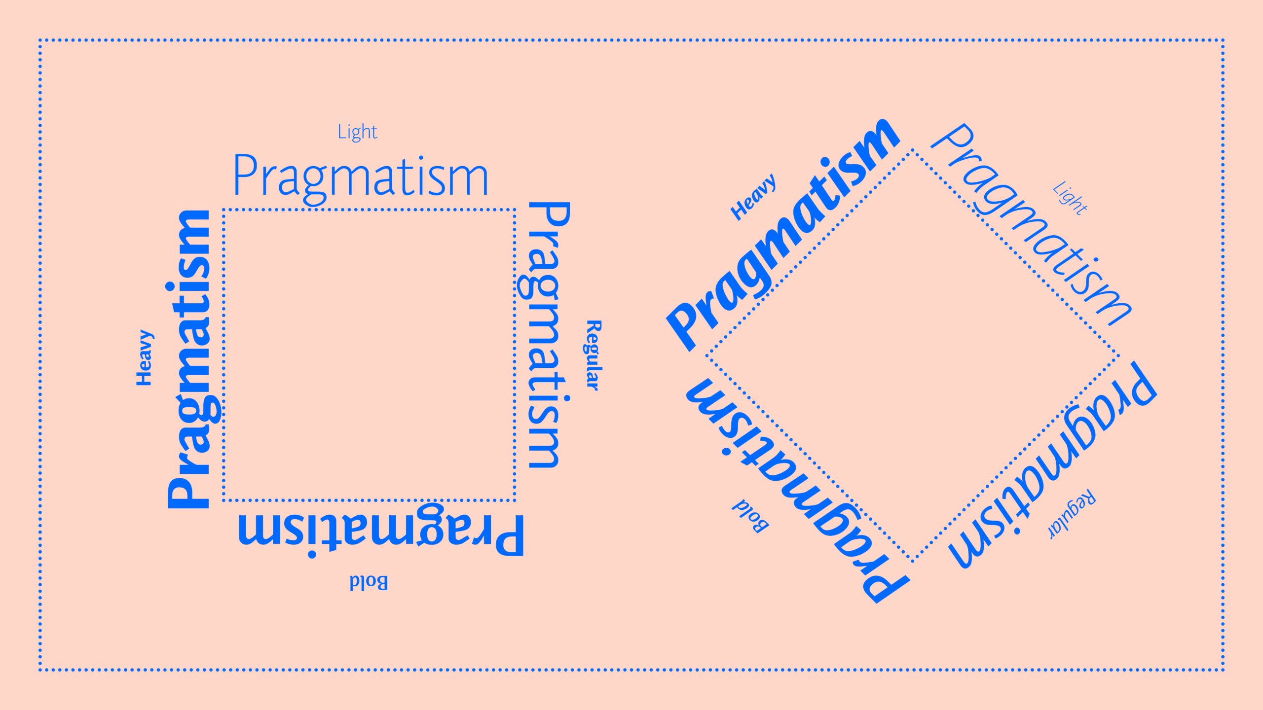
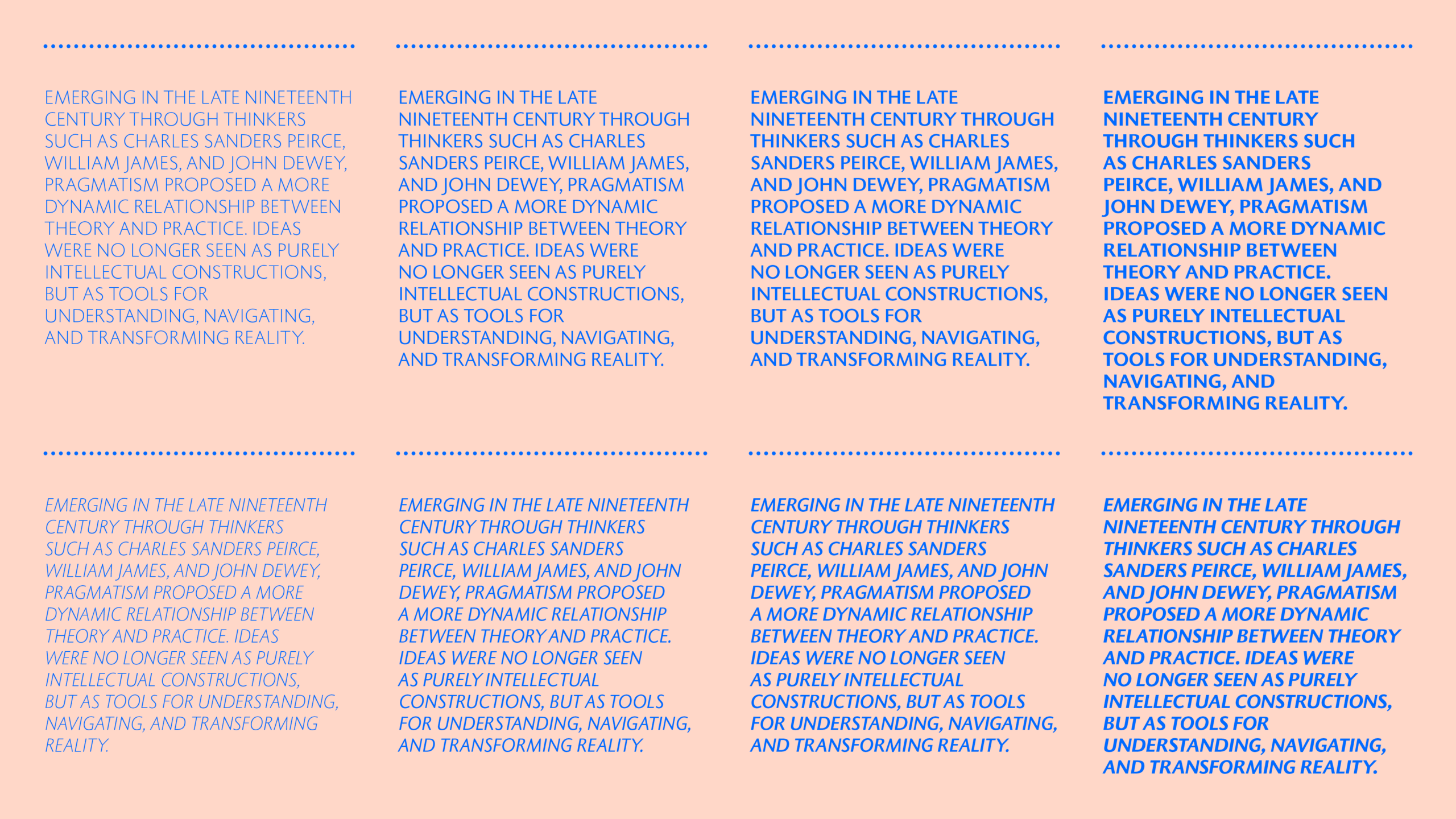
Pragma Family

BUY
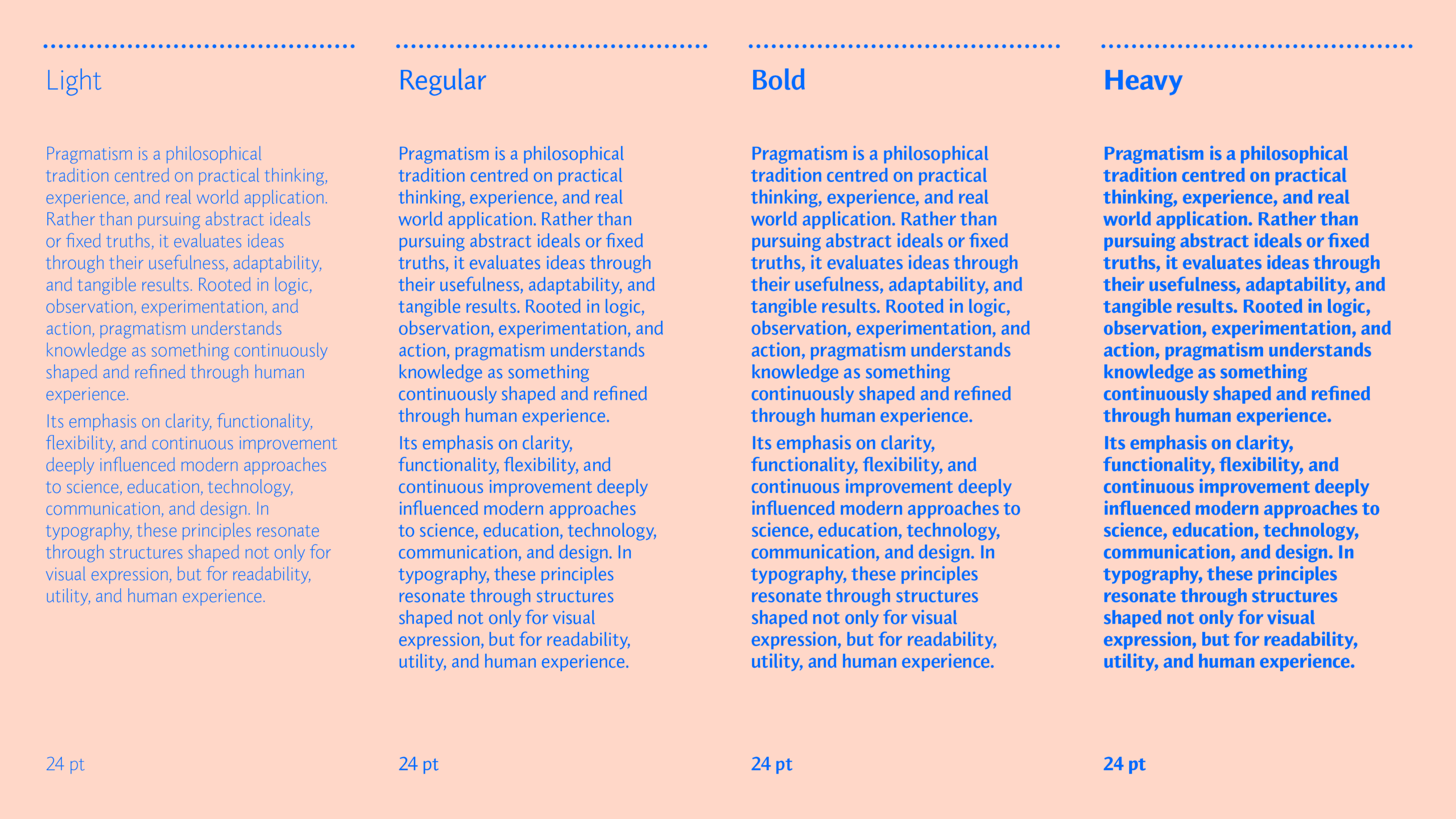
  • Pragma Light
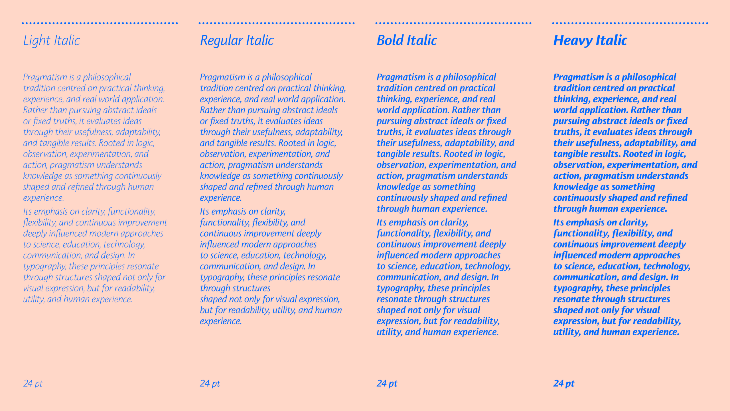
  • Pragma Light Italic
  • Pragma Regular
  • Pragma Regular Italic
  • Pragma Bold
  • Pragma Bold Italic
  • Pragma Heavy
  • Pragma Heavy Italic
Ba

TYPE TESTER

BUY
Type color
Background

Languages

Context

Pragma was developed during a period in which digital typography was rapidly transforming the way typefaces were designed, produced, and read. In the early 1990s, many sans serif designs embraced geometric construction, technological neutrality, and increasingly systematic approaches to typography.

Against this backdrop, Christopher Burke pursued a more historically grounded and human approach to sans serif design. Rather than treating sans serifs as purely industrial forms, Pragma reconnects the genre with the broader traditions of text typography, calligraphy, and inscriptional lettering.

Its structure reflects a synthesis of classical and contemporary influences. Roman capitals, humanist lowercase forms, and a genuinely cursive italic combine to create a typeface that feels both functional and deeply readable. This balance between precision and movement gives Pragma its distinctive texture and enduring versatility.

Created at the transition between analog and digital typography, Pragma remains an important example of late 20th century humanist sans serif design.

Biography

Christopher Burke was born in England in 1967. A typographer, type designer, and writer on modern typographic history, he has combined professional practice with academic research throughout his career.

Before beginning postgraduate studies, Burke worked at Monotype in the United Kingdom. He later studied Typography and Graphic Communication at the University of Reading, where he obtained a PhD in 1995.

From 1996 to 2001, he taught at the University of Reading and played a central role in planning and developing its influential MA in Typeface Design, a programme that would become one of the most important postgraduate courses in contemporary type design.

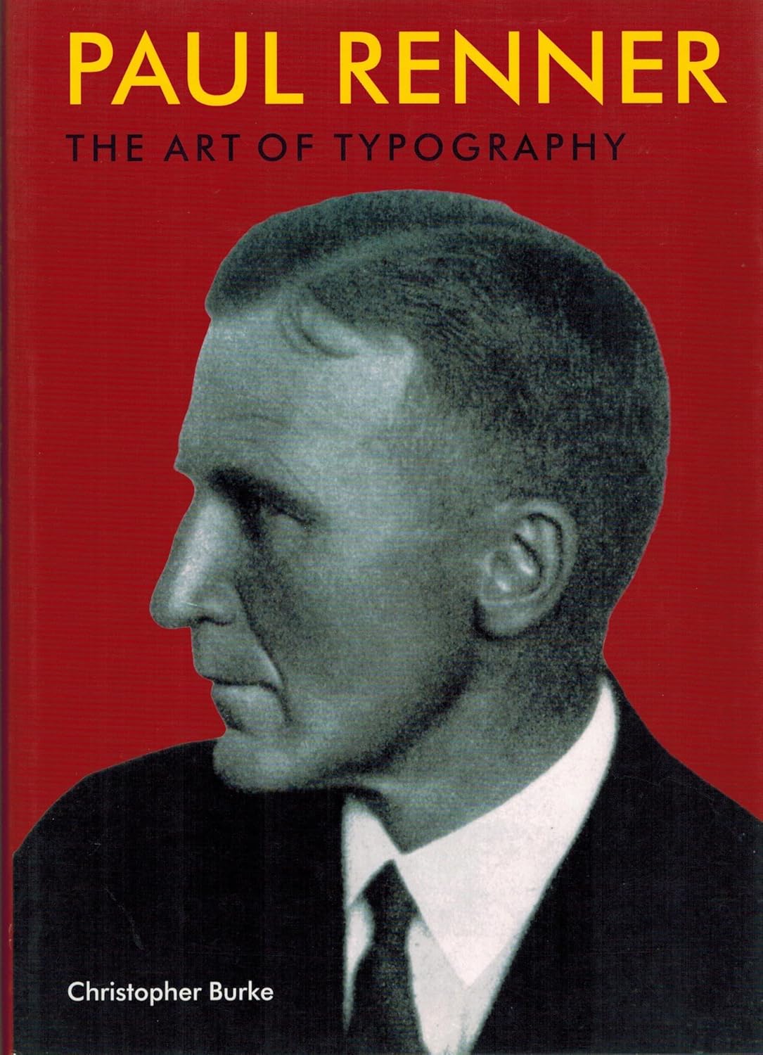
Burke is also the author of Paul Renner: The Art of Typography, published in 1998, a landmark study on the life and work of the German typographer and designer Paul Renner.

To know more about the work of Christopher Burke, we recommend this interesting book.
BUYING OPTIONS

1. PICK UP YOUR FONT

2. CHOOSE LICENSE & USAGE

LOOKING FOR SOMETHING ELSE?

We can offer you custom tailored licenses according to your needs - broadcasting, corporate, server, gaming.

CONTACT US

NEED MORE INFO ABOUT OUR LICENSES?

READ OUR FAQ
Subtotal in EUR

NEWSLETTER

Subscribe to our newsletter and stay connected with our work and the practice of quality typography.