Paris
BUYLEAD VERSION
- Designer
- Enric Crous-Vidal
- Foundry
- Bauersche Giesserei
(Bauer Types) - Year
- 1953
DIGITAL VERSION
- Digitalisation
- Neufville Digital
- Publisher
- Bauer Types
- Year
- 2005
DESCRIPTION
Paris is a display typeface designed in 1953 by Enric Crous-Vidal. Expressive, rhythmic, and deeply informed by calligraphic movement, the design brings warmth and vitality to mid century modernist typography
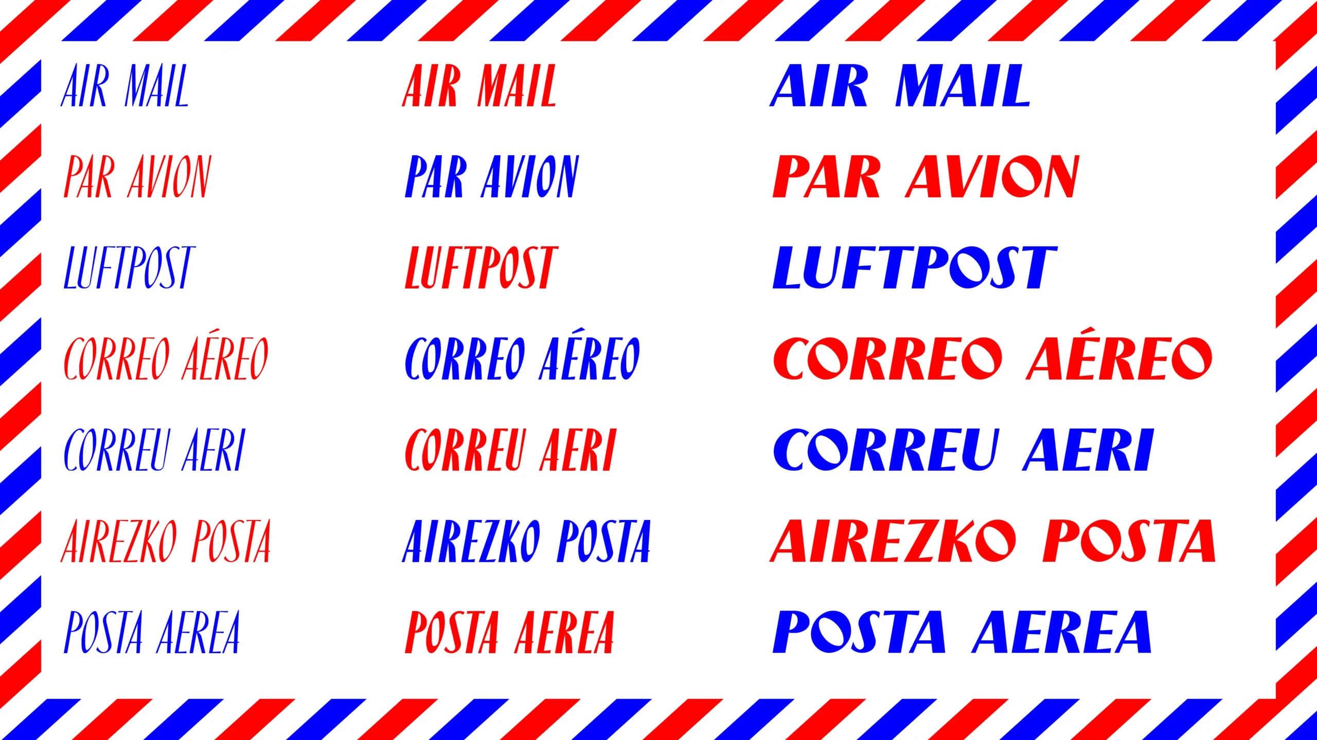
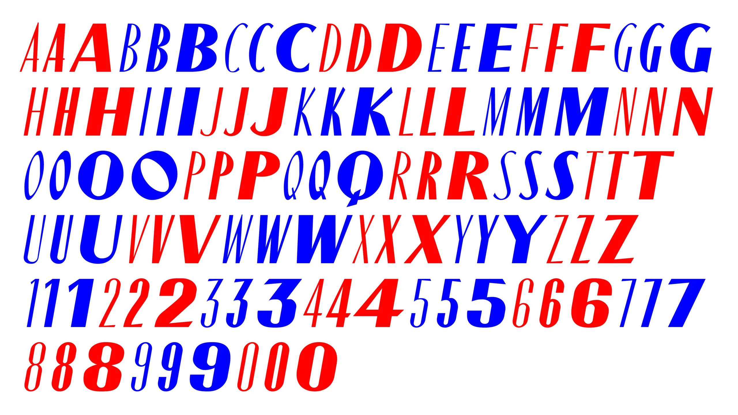
Its forms combine elegance with spontaneity through subtle modulation and carefully balanced proportions, creating a visual language that feels both refined and alive. In Paris Bold, two alternate capital O characters were originally included, one featuring a pronounced 45° stress. Both are preserved in the digital version, maintaining the richness and flexibility of the original design.
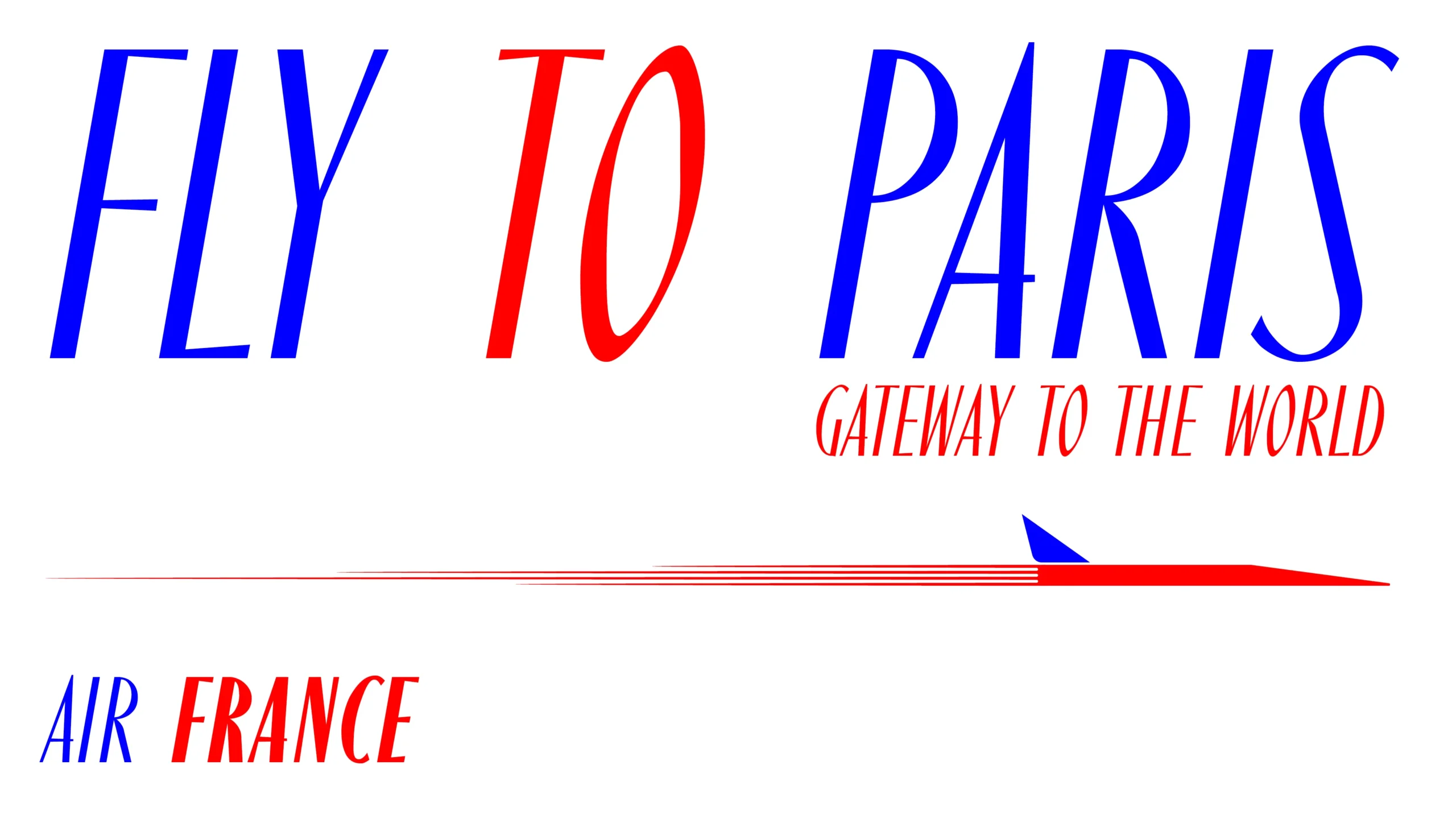
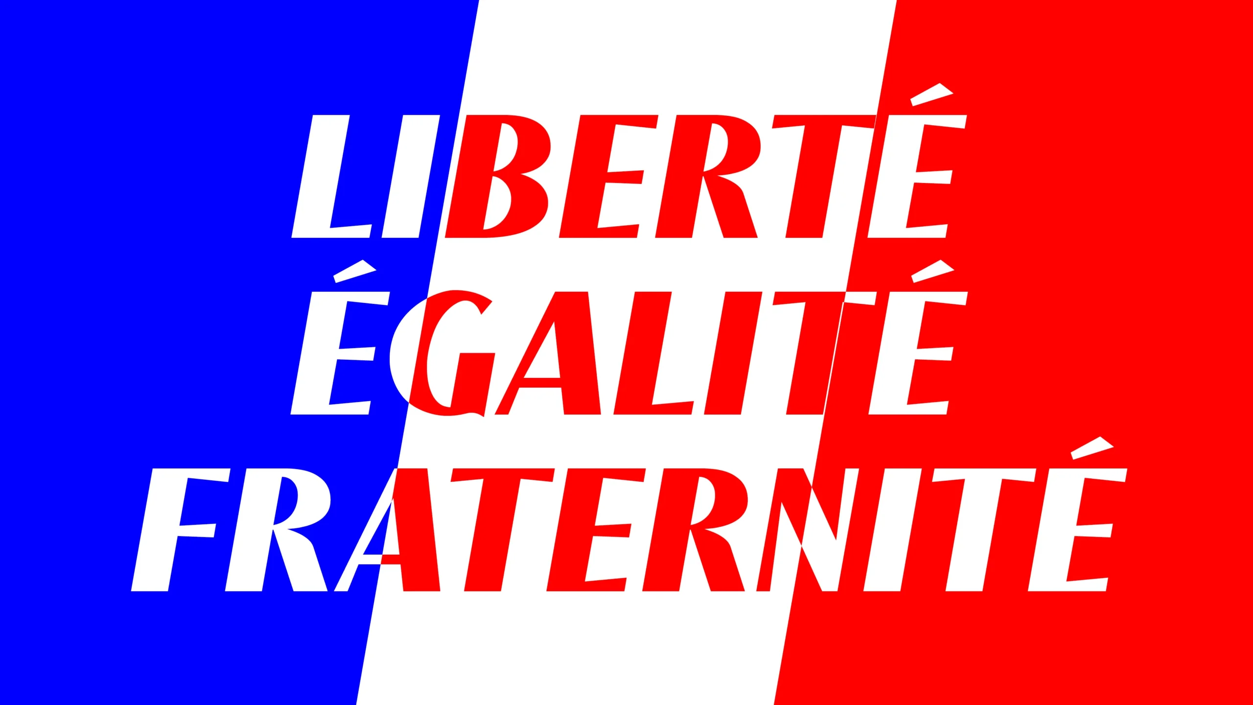
Oh La La!
Paris, a sophisticated uppercase typeface with Parisian spirit.
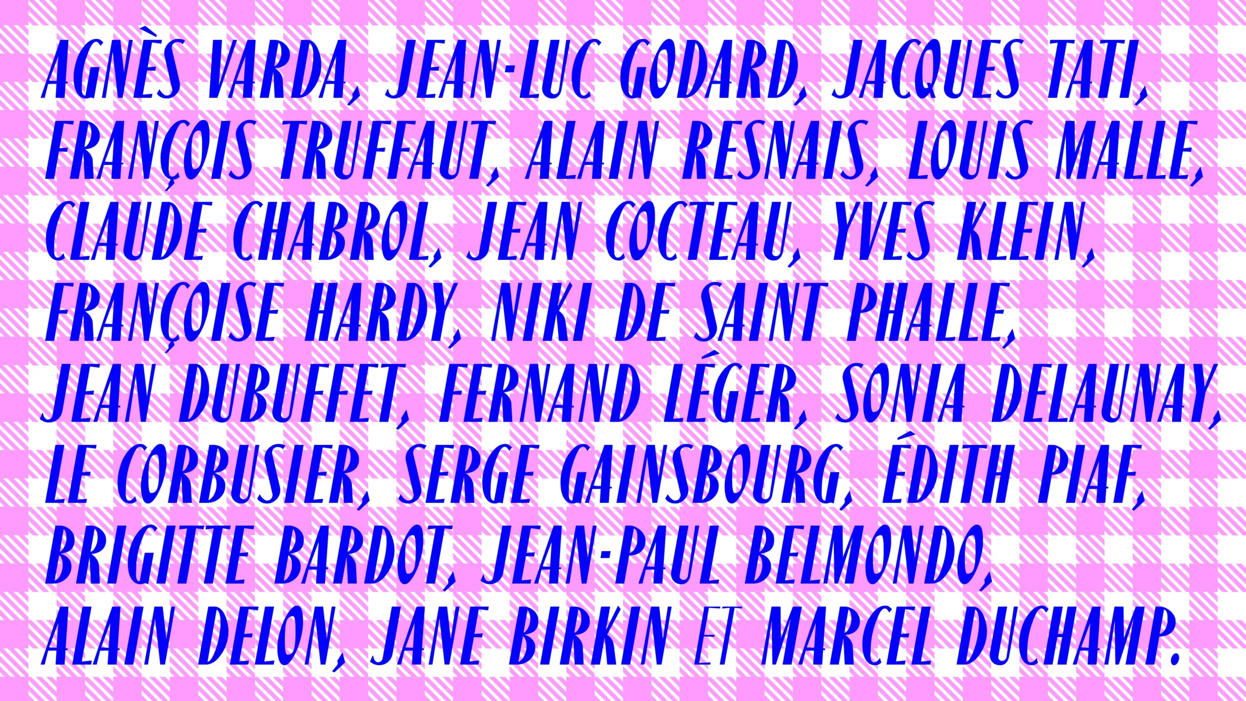
Paris in use
Paris Family
- Paris Light
- Paris Medium
- Paris Bold
Context
Paris was designed in 1953, at a moment when European graphic design was undergoing a profound transformation. In the post war years, modernist typography increasingly embraced rational structures, geometric precision, and functional clarity as universal principles of communication.
Within this landscape, Enric Crous-Vidal developed his Grafía Latina1 approach, pursuing a more expressive and human vision of typography. Rather than reducing letterforms to pure construction, his work explored rhythm, movement, contrast, and visual tension as essential qualities of reading and perception.
Paris reflects this search through forms that feel both sophisticated and alive. Its dynamic modulation and calligraphic energy challenge the strict neutrality that defined much of mid century design, introducing instead a sense of warmth, personality, and cultural depth.
Created during a period of intense experimentation across typography, publishing, and advertising, Paris stands as a distinctive example of how type design could remain elegant and functional while still conveying emotion and visual character.
1 Grafía Latina was a typographic concept developed by Enric Crous Vidal that proposed an alternative to rigid modernist typography, drawing inspiration from the visual culture, rhythm, ornament, and expressive traditions of Southern European and Mediterranean countries.
Biography
Enric Crous-Vidal was born in Lleida, Spain, in 1908. From an early age, he developed broad artistic and intellectual interests, becoming involved in the Catalan avant garde scene during the 1930s. Around 1933, he became founder and artistic director of the magazine Art, a publication that promoted contemporary artistic and graphic experimentation.
The Spanish Civil War profoundly affected his life and career. After serving in the Republican Army, he went into exile in France, where during the German occupation he joined the French Resistance, producing forged documents and false identification papers.
Following the end of the Second World War, he moved to Paris and began working at Draeger Frères, a renowned French printing house celebrated for its technical excellence and high quality art publications..
Around 1950, Crous Vidal opened his own studio and began designing typefaces that would define much of his contribution to post war typography. In 1952, he presented a typographic exhibition at the Galerie d’Orsay in Paris, and in 1954 he became Artistic Director of the Fonderie Typographique Française, supported by influential typographer and critic Maximilien Vox1. During the 1950s and 1960s, he developed many of his best known typefaces while advocating for an alternative vision of graphic modernity rooted in expressive and calligraphic principles.
He died in France in 1987, leaving behind a body of work that continues to resonate as a distinctive voice in 20th century European typography.
BUYING OPTIONS
1. PICK UP YOUR FONT
2. CHOOSE LICENSE & USAGE
LOOKING FOR SOMETHING ELSE?
We can offer you custom tailored licenses according to your needs - broadcasting, corporate, server, gaming.
CONTACT US